The making of this website
- 7 minsGetting started:
Deciding on tech:
This isn’t the first time I’ve tried making a personal website, but it is by far my most successful attempt. Why? The first reason that comes to mind is experience (having taught a web development class at MIT and industry experiences), although I would say that I’ve forgotten most of the web development know-how since I haven’t touched web development since early 2022, and have been steadily relearning as I build this website. A better reason for why I am successful this time, I would say is that I have a much better understanding of how computer systems such as the internet and operating systems, and code at different levels of the tech stack interact to produce the surprisingly functional behavior that we come to expect from our computers. With this comes a confidence in knowing what I want my website to look like, as well as the ability to quickly learn the skills to make my ideas come to fruition. One of the main failures in my first attempts (and one that often hinders my progress on other things) was the belief that I had to create something that was perfect, in other words, I let the perfect get in the way of the good enough. While there is something to be said about a bad website being more detrimental to first impressions than not having a website at all, the threshold for this is actually quite low, and no great website was made without layers and layers of tweaks. As I had started with very little experience, yet aimed to make something comparable to a developer’s website with many years’ experience, I was bound to fail.
This time around, I aim to make a website that is very simple and easy to work with, at least initially. The complexity could increase after I am satisfied with a first version. This is the essence of spiral development, and is what I should have started with in the beginning.
The first step was to decide what tech stack I should use for my website. After some brief research and looking into domain names, I found that hosting my website for free on GitHub Pages seems ideal (I don’t want to host on my server, since I want to reduce its attack surface, among other considerations). GitHub pages is slightly limiting in that it can only host static websites. This isn’t really a big issue, and would serve the purposes of a portfolio website quite well. Like in my previous attempts, I decided to start off with a Jekyll theme, and modify it to my preferences.
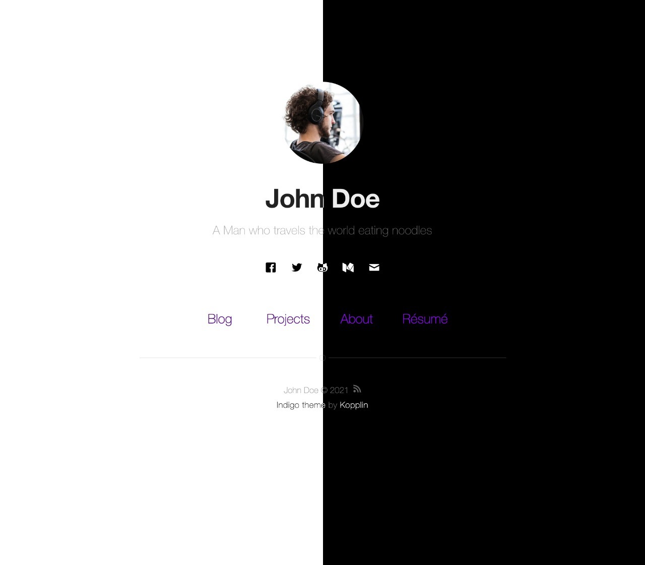
I chose to start off with Sergio Kopplin’s Indigo Jekyll theme, with the following example screenshot, which shows a split view of the dark and light modes of the website:
Making Changes
To get started, I began by entering in my information into the _config.yml file, e.g. entering in my name, bio, setting the theme to dark, adding my resume link, and adding my socials.
It’s very easy to run the website locally for development:
bundle exec jekyll serve --livereload
Color Theme Changes
I wanted to have my website be in dark mode. While I find that the default light mode color palette looks pretty good, I didn’t really like the default dark mode palette, with its fully black background and deep purple highlight color.
I chose to select my own color palette. I like the color theme that I use for VSCode, so I used MacOS’s Digital Color Meter to get the hexes for different colors on the screen. The changes to the colors I made mostly consisted of brightening the fully black background, toning down the purple, and slightly darkening bright white fonts.
The vast majority of the color changes were made in _sass/base/variables-dark.sass. Here, the colors in the palette were designated by greek letters, which seemed to be pretty generally used. Thus, I just changed those values to the ones that I liked, which was a nice programmatic way to change the colors on the entire site.
Changing the home page
While I do like the way that the landing page looks, I also wanted to improve it to my taste. One effect that I’ve always really liked is the typewriter effect, where the website seems to type out text in front of your eyes.
Since this effect is relatively common these days, I though that there would be some nice accessible libraries that I could just use to produce the effect. However, after looking online for a bit, I only found one that seemed to do it, and it was quite old and didn’t really produce the exact behavior that I wanted. For example. I wanted it to start off as just a blinking cursor, then after a delay, start typing (and the cursor should not blink while typing), and once it is finished typing, then the cursor should remain at the end and start blinking again. Most of the examples I found online either never blinked, or always blinked, even while “typing.” I also wanted the blinking cursor to smoothly fade in and out, rather than flash discretely.
Since the behavior I wanted is relatively complex, I decided to write a javascript function that could easily handle the different state changes for the effect. While I’m sure that it would be possible to do it in pure CSS, I felt like such a solution would be necessarily bespoke for its given text, and would need to be adjusted if I ever changed the text. I wanted to just write a function with a simple api, so I could easily reuse the effect if I changed the text in the future.
The way I implemented it, all that was needed to add the effect to an element is to add the typewriter class to it. My code in assets/scripts/typewriter.js handles the effect, by finding an element with the typewriter class. The actual blinking effect on the caret (text cursor) are handled by the CSS in _sass/components/header.sass.
Other small changes to the home page
One of the first things I did on the home page was to turn my name into an anchor tag, which would link to the home page, if the current page is not the home page.
One thing that took way longer than it should have, was figuring out how to properly put the footer at the bottom of the page, even when there wasn’t a full page’s worth of content. After trying many tricks with relative and absolute positioning and such, I eventually just used flexbox, and… it worked on the first try. haha.
I also tweaked the size of the social icons, since I’m only choosing to display three of them.
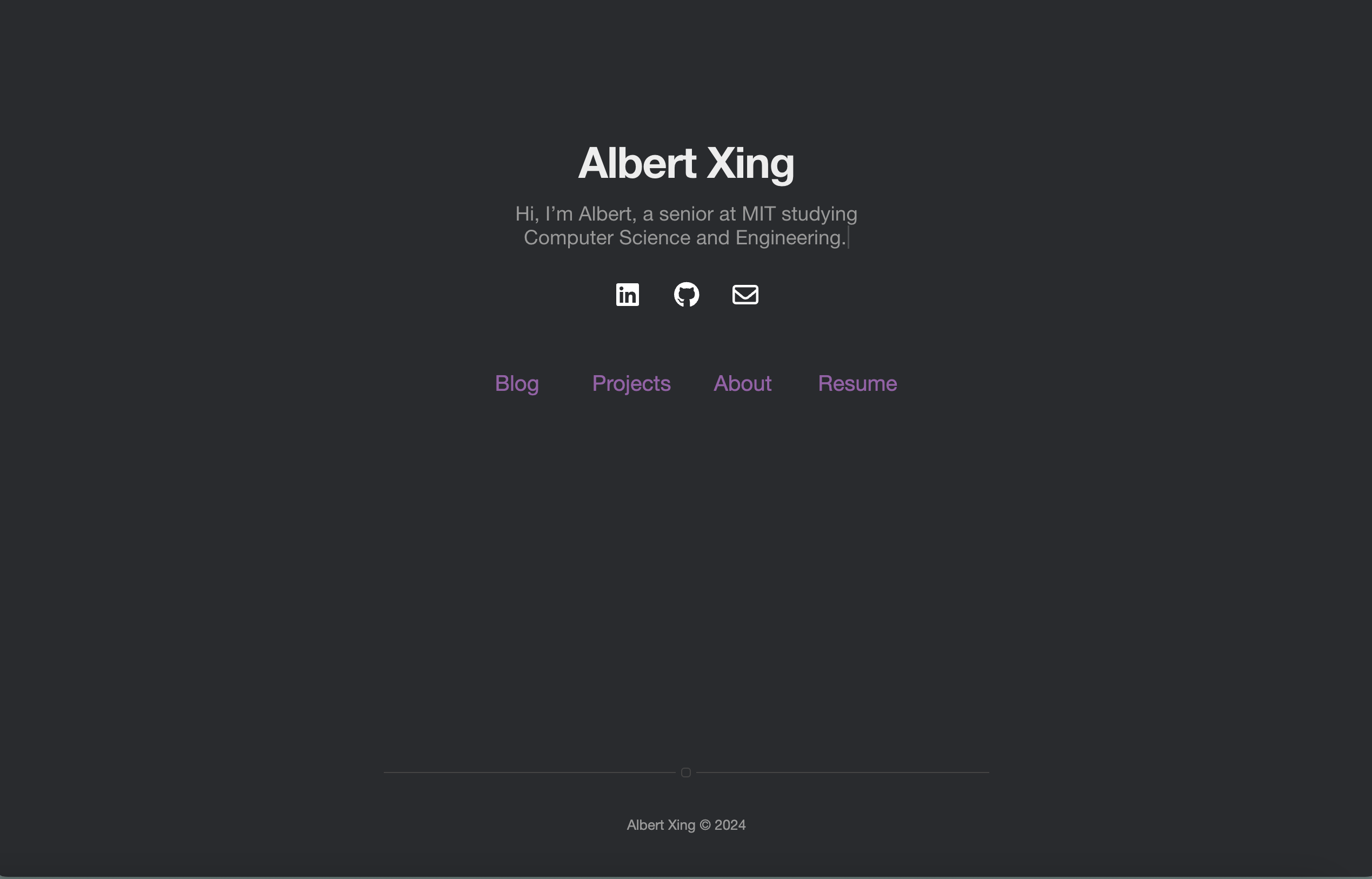
After all of these changes, the home page now looks like this, which I’m a lot more satisfied with.
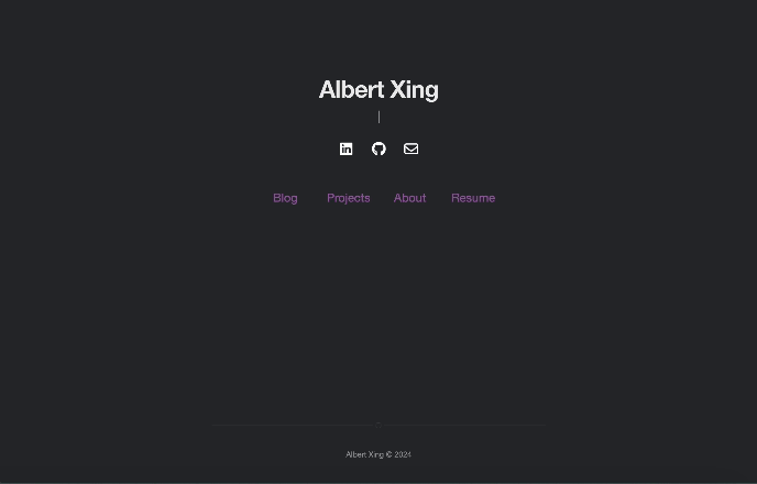
And here’s a gif of the page
Next steps
The rest of the website still looks a bit… needing work. However, I want to try getting this published ASAP, especially since I want to try getting it set up with a custom domain name. I’m thinking albertx.ing. By the time you’re reading this, it should be already up.
But first, I’m going to do a first order clean up the other pages on the website.